


Featured on Design Rush: 10 Best Snacks Packaging Designs That Elevate Your Snacking Experience
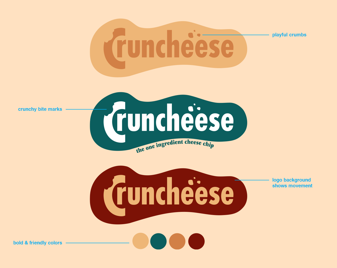
Logo and color palette

Alternate Logo

Copy, Icons, typefaces, colors, type styles
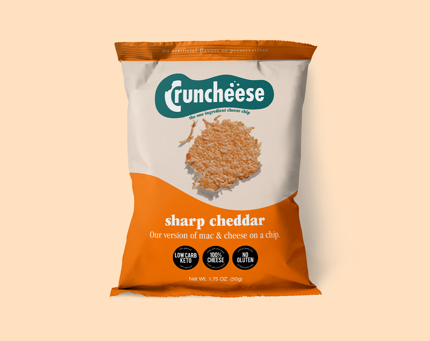
Front of product packaging

Product packaging, 3 flavors

Front and back design

Flat mechanical, front and back

Pattern for bundle box (scroll to see the box) - I wanted to create a sense of playfulness, movement, or dancing even. When a customer sees this product, I want them to think "Keto does not have to be boring"! The type was set strategically to look like it's moving or dancing. The cheese icons were carefully crafted to function as cute little icons both on a pattern and on their own, with a nice pop by adding a background to each piece of cheese.

Info for bundle box (scroll to see the box) - Here I intentionally layed out all the keto health info in a fun way. Reading nutrition or ingredient facts does not have to feel like a chore. With this info panel on the bow (below), the customer doesn't have to feel like they are fishing for info. It is all layed out in a visually pleasing way per product.

Watch me build the Cruncheese packaging from concept to dieline. In this video I take you into a glimpse of my design style and print production knowledge, using Adobe Illustrator.
Featured on Design Rush: 10 Best Snacks Packaging Designs That Elevate Your Snacking Experience


